01 / At a glance
One business. Different reasons to visit.
Choosing a service should not lead to a form built for a different customer.
- The problem
- Some commercial and custom-cleaning actions opened a residential booking form built around bedrooms and bathrooms.
- The approach
- Review destinations, separate service journeys, explain starting prices, and refine mobile navigation with the client’s feedback.
- The delivery
- Service-specific forms, consistent pricing language, a shorter application path, and responsive interface refinements.
Contribution & collaboration
My responsibilities covered website review, user flows, content, interface design, frontend updates, and QA. The client supplied business policies, form destinations, and annotated feedback. TidyTrack managed the hosted forms, which set the boundaries for booking and application changes.
02 / Review & priorities
Fix the wrong destination before polishing the page.
Client feedback
Annotated screenshots called out pricing, button spacing, mobile navigation, and extra steps in the hiring journey.
Website review
Following service links exposed a mismatch between the selected service and the information requested by the destination form.
Browser checks
Navigation, responsive layouts, form loading, and accessibility checks identified problems that could be addressed on the website or referred to the provider.
Priority followed the consequence
Incorrect forms came first because they interrupted the task. Pricing clarity followed, then mobile orientation and visual consistency.
These decisions came from client feedback and website review. Customer interviews and formal usability testing were outside this phase.
03 / Service journeys
Match the next step to the service.
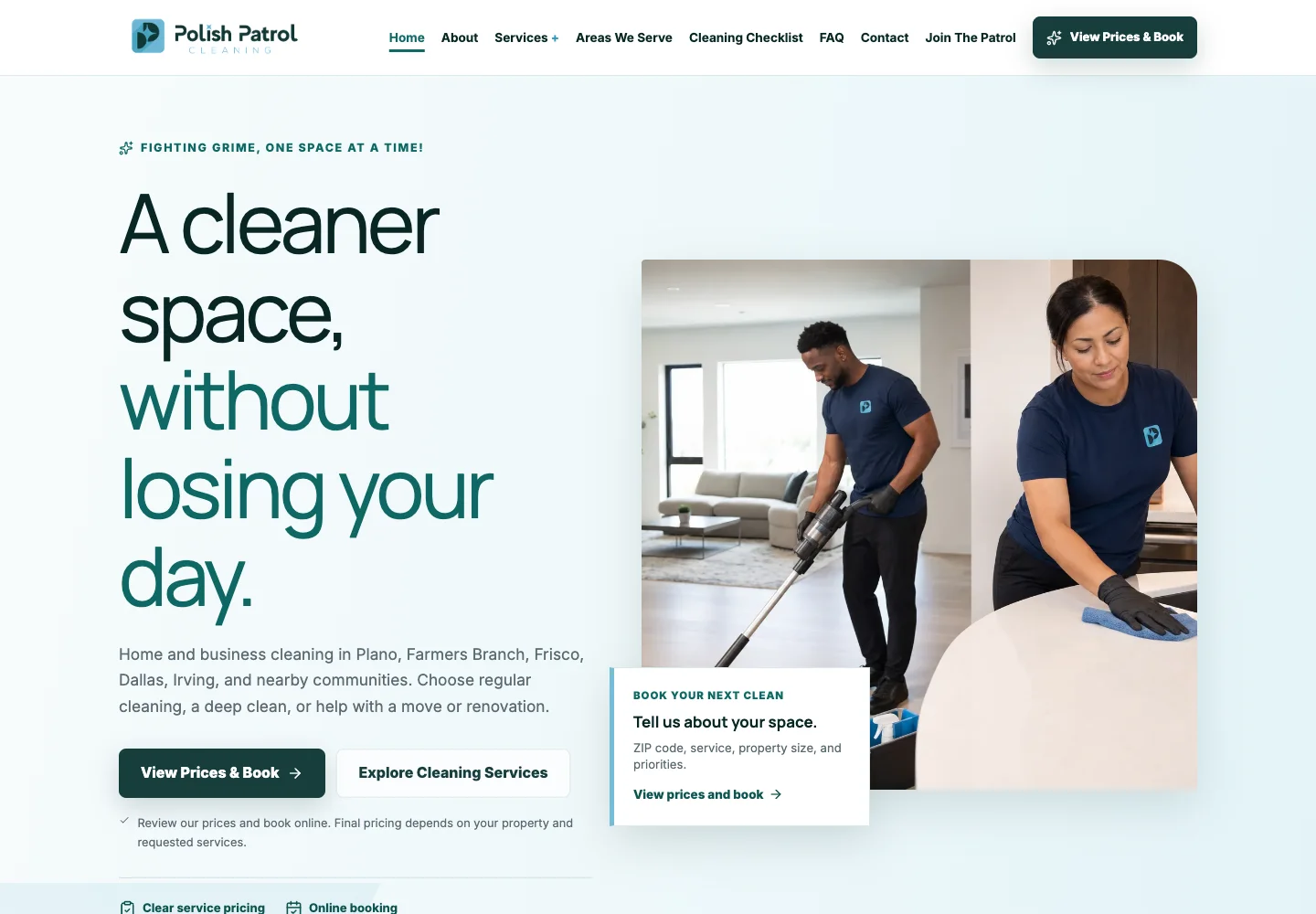
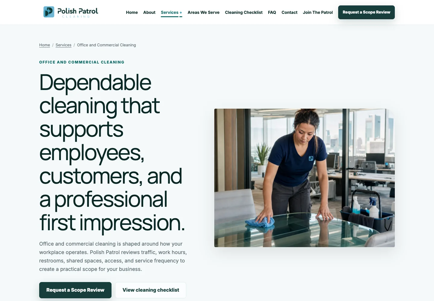
A single booking link was easier to maintain, but it asked different customers to follow the same process. Residential customers could book from defined options; commercial and custom work needed a conversation about scope.
Residential
- Compare services
- Review starting prices
- Book online
Commercial
- Explore business cleaning
- Describe the scope
- Team follow-up
Custom cleaning
- Review service options
- Send a contact request
- Individual review
Shared destinations now keep service cards, navigation, footer links, and mobile booking actions consistent. Commercial inquiry buttons lead to the scope-review form; custom and post-construction requests lead to the contact form.
04 / Pricing & content
Explain the price before asking for a commitment.
The pricing menu compares three services across six bedroom-and-bathroom configurations. Adding “+” to starting rates makes room for differences in property condition, size, and additional work.
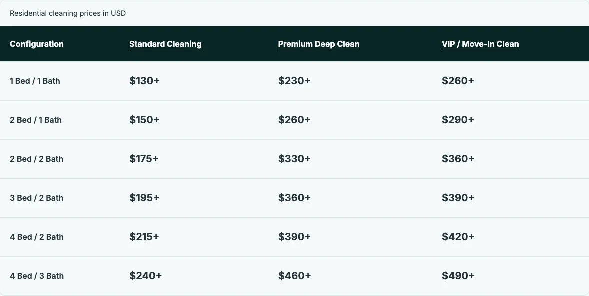
Separate service from frequency
“Recurring Cleaning” became “Standard Cleaning.” Customers can choose the service without assuming a recurring commitment; a one-time visit remains an option.
Keep payment amounts exact
The “+” belongs on advertised rates, not deposits or checkout totals. Shared policy content keeps deposit, cancellation, and additional-work explanations consistent across FAQ and Terms pages.
05 / Mobile experience
Keep the next step clear on a smaller screen.
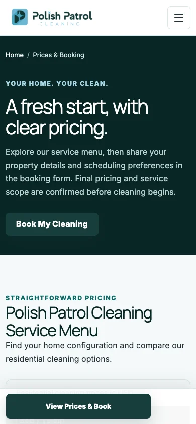
The client’s screenshots showed a booking button too close to its paragraph, no current-page indicator in the menu, and inconsistent image corners.
Small changes with a clear purpose
- More space above buttons separates the action from supporting text.
- A visible current-page state helps visitors stay oriented.
- Stacked pricing groups keep service comparisons readable.
- The persistent booking bar is identified as navigation for assistive technology.
A service-area fallback
Irving was added to the coverage content and ZIP list. An unlisted ZIP code can still be submitted for review, so a missing entry does not automatically rule out a customer.
The provider keeps its own coverage settings; those restrictions need to be checked separately.
06 / Client feedback
Client feedback changed the hiring journey.
The first approach sent applicants straight to the provider’s careers page. The client wanted to retain the company introduction and application guidance.
Initial approach
Go directly to the provider
A shorter route removed Polish Patrol’s own team introduction.
Revised approach
Keep the context, remove the repeat
The restored “Join the Patrol” page leads directly to the full application, skipping a second introduction page.
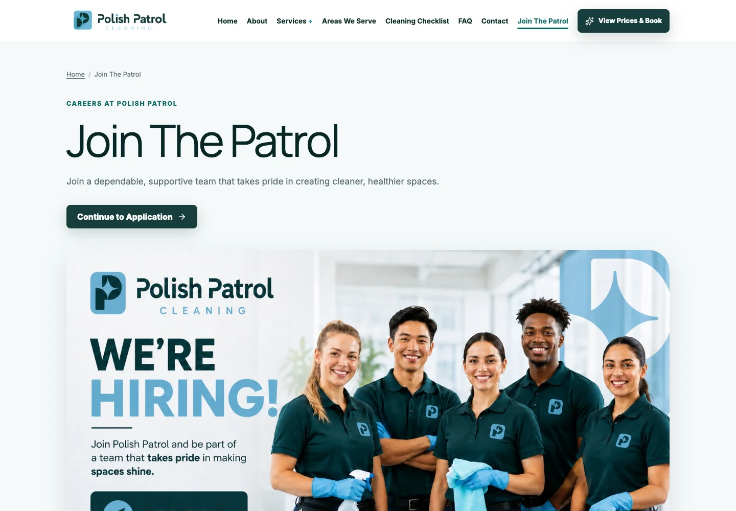
At the client’s request, the application opens in a new tab so the company page stays available. Application completion has not yet been measured.
07 / Delivery & constraints
Work within the booking system’s boundaries.
The existing residential widget and commercial form remained in place. Rebuilding them would have changed the submission process and expanded the scope beyond the website redesign.
Website changes
Descriptive embed titles, direct fallback links, and form resizing help customers identify the form and reach its final fields. Shared content keeps policies and destinations consistent.
Provider follow-up
Form-button styling, address autocomplete, percentage tipping, and hosted-form accessibility issues were collected in a TidyTrack checklist for the client.
This kept unresolved provider issues visible instead of treating the website changes as a fix for everything in the booking journey. AI tools assisted with code and QA.
08 / Outcome & next steps
A clearer route from interest to action.
- Residential, commercial, and custom requests now reach distinct, appropriate forms.
- Starting-price language and service details are consistent.
- The hiring page retains company context and leads directly to the application.
- Mobile navigation and pricing are easier to scan.
Browser checks covered navigation, layouts, and form loading without sending live inquiries or payments. Mobile checks used browser emulation. They establish technical behavior, not an improvement in conversion or customer satisfaction.
What comes next
Task-based sessions with homeowners, business customers, and applicants would test whether people can choose a service, explain a starting price, and find the correct form. Booking starts and completions should be compared using provider records, with a baseline and comparable reporting period.
The lesson
A shorter journey is not always a better one. Restoring the hiring introduction preserved context the client valued; removing the repeated introduction made the next step more direct.
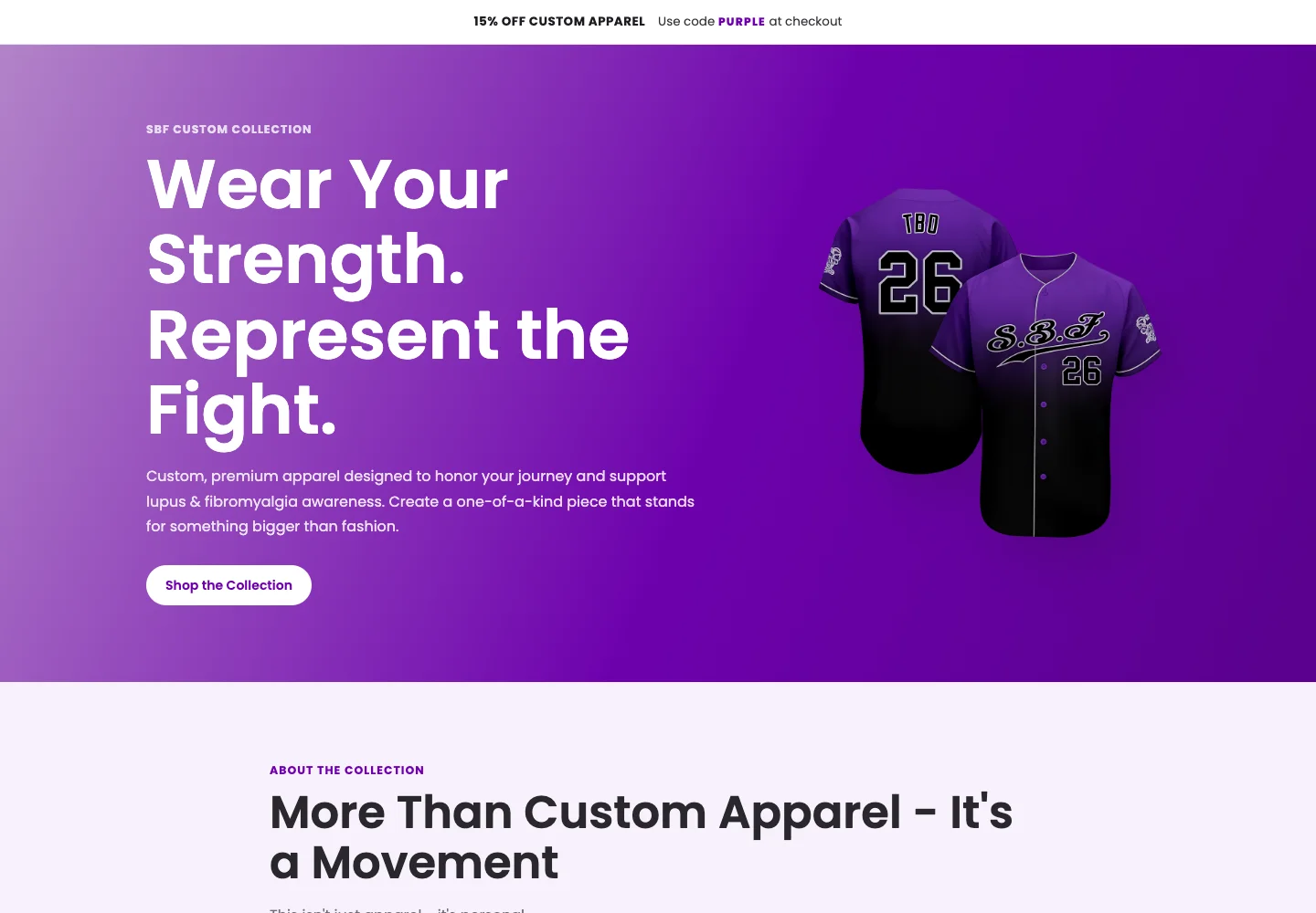
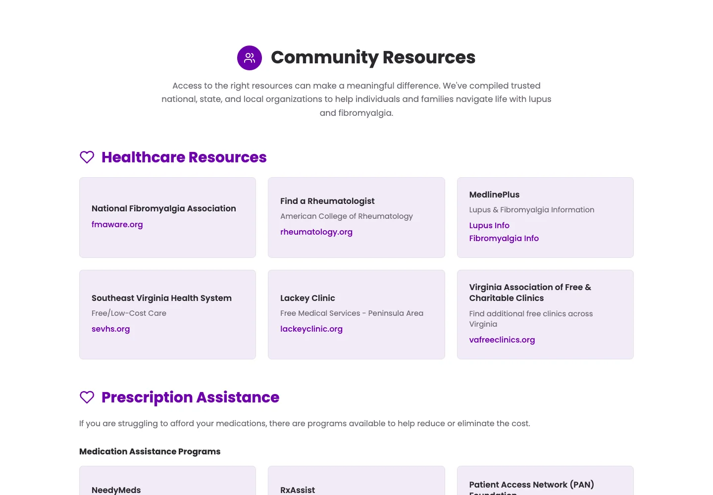
Social Butterflies Foundation
to support.
Apparel discovery & resource access