NEUROMODE / NATIVE iOSA smaller start. A way back.
Support that makes room for the person.
Initiation · Sensory comfort · Continuity
01 / THE 30-SECOND READ
Help before a plan to maintain.
Naming a task, choosing a priority, estimating time, and remembering where you stopped are separate demands. NeuroMode asks whether support can be useful before someone has the energy to organize all of them.
For whom
People experiencing friction with initiation, attention, transitions, or sensory comfort—including neurodivergent people. No diagnosis or disclosure is required.
The response
Need-based entry, editable next steps, silent sensory defaults, and saved context for returning.
My contribution
An independent product-design and SwiftUI implementation project, brought into an explicit UX model through structural analysis, reconstructed wireframes, accessibility review, and a design handoff specification.
The outcome
A working native product with retained simulator evidence and documented technical evaluation. Its usefulness with participants remains to be tested.
THE DESIGN QUESTION
How might support make the next action manageable without making setup, sensory demands, or recovery another task?
The dates identify repository milestones and the case-study audit, not an end-to-end project duration. This is everyday support, not a diagnostic or treatment product.
02 / RESEARCH & FRAMING
Separate what exists from what works.
The product existed before this formal case-study reconstruction. Desk research, comparative documentation review, and a source-based heuristic walkthrough explain and challenge the implementation retrospectively. They are not presented as the historical cause of every decision.
Evidence base: SwiftUI behavior, retained screenshots, two Git milestones, and validation records. No completed interviews, surveys, or participant usability sessions were found.
01
Help should precede self-description.
Evidence
W3C cognitive-accessibility guidance emphasizes clear purpose and manageable paths; Today already exposes three immediate support actions.
Interpretation
Setup may itself add work.
Design implication
Keep onboarding skippable and check-in optional. Test whether “start,” “focus,” and “less stimulation” are distinguishable.
02
Returning is part of the task.
Evidence
The implementation stores a concrete next step alongside focus-session state; memory support is a lens in the desk research.
Interpretation
Elapsed time alone cannot reconstruct intent.
Design implication
Save the person’s wording and pause together. Evaluate whether that cue is sufficient when they return.
03
Quiet is a choice, not one setting.
Evidence
Quiet Room begins silently; sensory controls and comfort drafts are independent in the implementation.
Interpretation
An intervention intended to help can still impose stimulation.
Design implication
Make audio and breathing explicit opt-ins; preview persistent preferences before applying them.
Compare organizing models, not feature counts.
Apple Reminders
Lists, sections, and subtasks
Externalize and organize work.
Structured
A visual day timeline
Place activities in time.
Goblin Tools
Focused everyday tools
Choose a tool and judge its output.
NeuroMode’s opportunity is a short route from a present need to an adjustable action. Local task templates favor predictable behavior over broad interpretation. The cost is limited suggestions that may not fit someone’s activity.
Comparison scope: official product descriptions reviewed for the case study; no hands-on benchmark or competitor accessibility audit.
Changing needs, rather than fixed personas.
A smaller entry point. “Start laundry” may still need a smaller, user-authored action.
Fewer simultaneous demands. Reduce what is visible without hiding the way out.
A reliable return. Keep the next action available across an interruption.
Control over disclosure. Preview selected support statements before sharing.
These are conceptual behavioral lenses and constructed scenarios, not validated audience segments or participant quotes.
Research references & scope
The supplied September 25 research dossier uses these sources as design lenses, not proof of NeuroMode’s effectiveness.
Today offers immediate support; the other destinations organize deeper capabilities. Each tab has its own native navigation stack. Less stimulation replaces the tab shell with a quieter experience—it is not a sixth destination.
TodayImmediate help
ModesFocus & sensory tools
PlanNow / Next / Later
SupportCapture & reusable tools
YouPreferences & data
Trade-off: shared destinations are easier to reach from several contexts, but Modes and Support may be difficult to distinguish. A tree test should challenge that grouping.
One journey: start, leave, return.
01
Ask for help
Today → Help me start. Name an activity only when needed.
02
Adjust the step
Make it smaller, choose a different step, or write your own.
03
Focus
Carry the activity and current step into a timed or untimed session.
04
Save and pause
Write the next action. Save it and preserve remaining time.
05
Return
Open the saved session, read the cue, and resume deliberately.
Preserving context is an interaction requirement, not just a persistence feature.
Constructed walkthrough of implemented behavior. A failed save keeps the focus sheet open; a return does not silently restart the paused timer.
04 / REVERSE-ENGINEERED WIREFRAMES
Take the interface apart. Make the reasoning visible.
Reconstruction turns a working interface into something that can be questioned: what deserves attention, what can wait, and what must survive a change in state?
01 · Implemented productInspect views, navigation, and saved state.
02 · Structural analysisSeparate hierarchy, disclosure, and recovery.
03 · Reconstructed wireframesMake the core screen relationships reviewable.
04 · Figma-ready handoffSpecify components, variants, and prototype edges.
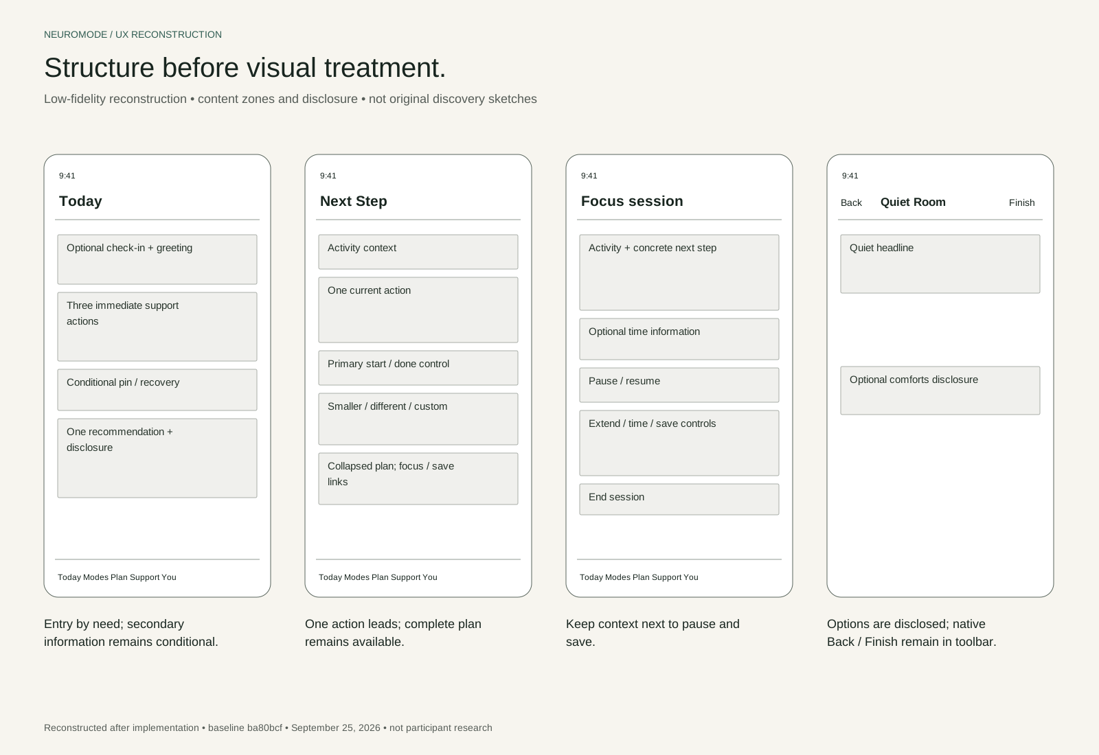
The wireframes were created after implementation. They are not original discovery sketches. The Figma specification is complete as a handoff document; a live Figma file and evaluated Figma prototype are not yet available.
Low-fidelity reconstruction: Today, Next Step, Focus, and Quiet Room. Select to enlarge.
What the abstraction reveals
Today introduces a need before an inventory. Next Step elevates one action above a whole plan. Focus keeps the next step near the save controls. Quiet Room moves optional stimulation behind disclosure.
What it challenges
Reducing visible content can also reduce discoverability. The next evaluation should test whether people can locate secondary actions and exits, not assume that fewer elements mean less effort.
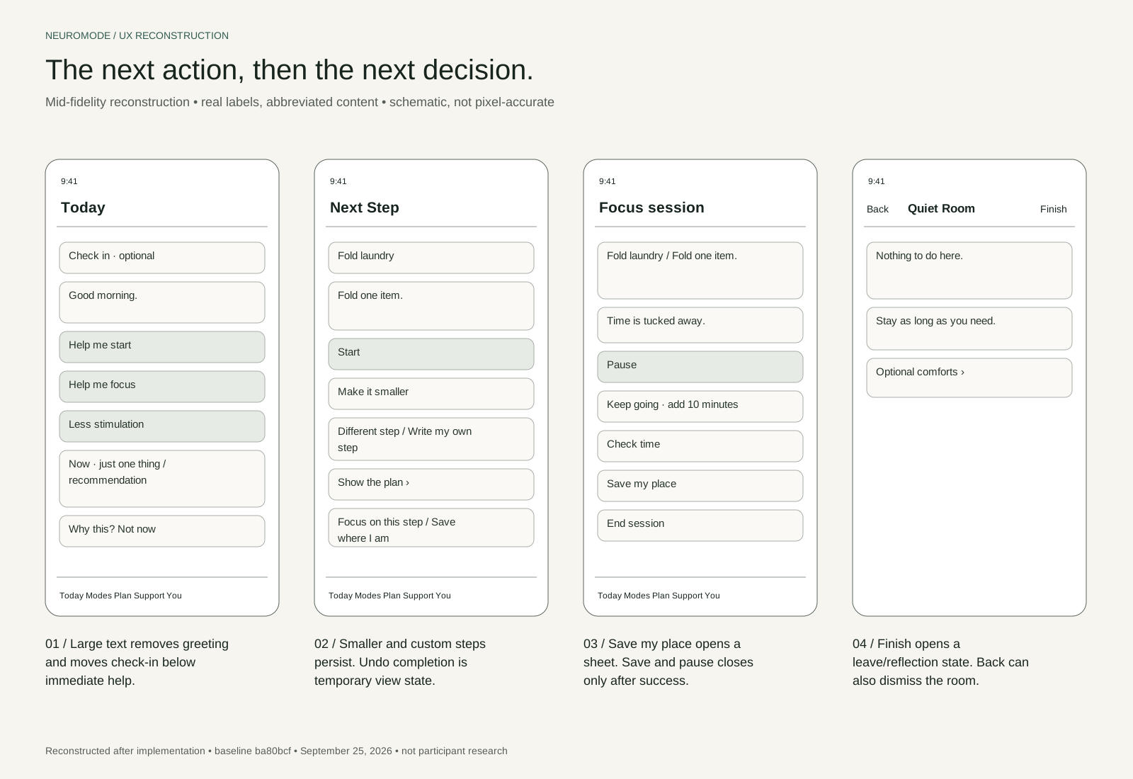
Mid-fidelity reconstruction: real labels and annotated interaction states; schematic, not pixel-accurate. Select to enlarge.
From structure to a buildable design contract.
PROPOSED FIGMA COMPONENT
Session / Focus / Paused
Preserve the activity, user-written next step, and paused state.
IMPLEMENTATION REFERENCE
FocusSession · FocusParkingView
Saving and pausing are one action. Close the sheet only when the save succeeds.
The handoff specifies semantic color modes, Auto Layout recipes, native text styles, component variants, error states, and a start-and-return prototype path. Those contracts make future Figma refinement traceable to actual product behavior.
A full tool catalog exposes everything; a required check-in asks for explanation before help.
Implemented direction
Three direct Today actions with optional check-in.
Trade-off to evaluate
A shorter entry path, at the cost of overlap with the recommendation card. Terminology still needs validation.
02 / DESIGN DECISION
Time that can stay out of view.
An always-visible countdown may add pressure; removing time entirely reduces choice.
Implemented direction
Timed or untimed focus, with countdown hidden by default.
Trade-off to evaluate
More control introduces more setup. Test whether hidden time makes transitions harder.
03 / DESIGN DECISION
Preview before preference.
Automatic adaptation risks surprise; one global quiet switch bundles different needs.
Implemented direction
Separate sensory controls, a draft preview, Apply, and local Undo.
Trade-off to evaluate
Explicit effects improve inspectability, while additional settings create complexity. Undo is not permanent history.
Alternatives are retrospective design explorations. They are not undocumented historical prototypes or proven winners.
06 / VISUAL & INTERACTION SYSTEM
A quiet surface. An explicit contract.
Warm neutral surfaces and sage actions establish the product’s identity. Semantic typography and native controls keep that identity responsive to appearance, text size, and familiar platform behavior.
Canvas#F7F5ED
Surface#FEFBF6
Action / light#305C52
Action / dark#9ED1BD
Typography
Semantic SF Pro styles in the app; content hugs its height rather than freezing to a screenshot. The portfolio retains Plus Jakarta Sans.
Spacing & form
Shared cards use 22-point padding and a 24-point radius. Internal spacing grows from 16 to 24 points in simpler layouts.
States
Applied versus draft, paused versus active, saved versus failed. Labels and native semantics carry meaning alongside color.
Motion
System and in-app preferences can suppress animation. Quiet Room does not require motion or sound to communicate its state.
Color values are rounded source mappings. Increased contrast uses system surfaces; the custom accent has no separate increased-contrast asset. This is not a whole-app contrast or conformance claim.
07 / THE IMPLEMENTED EXPERIENCE
Different needs. The same right to choose.
START / IMMEDIATE SUPPORT
The next action is easier to find.
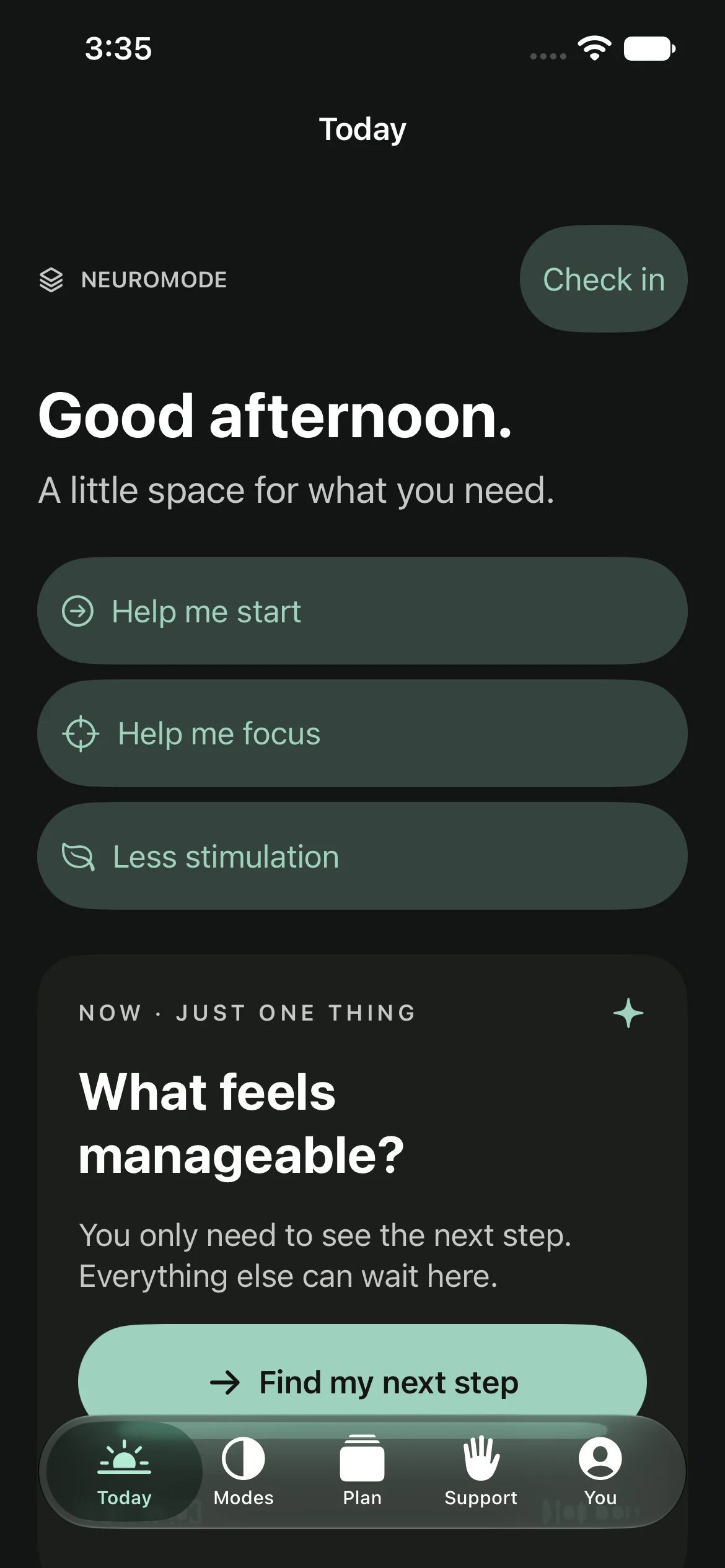
Today gives starting, focus, and less stimulation clear entry points. At accessibility text sizes, useful actions take priority over the greeting.
Retained dark-appearance capture. Selected simulator states were reviewed; the complete accessibility matrix remains open.
Today in dark appearance: immediate support before deeper tools.
PAUSE / SENSORY SPACE
Nothing starts without a choice.
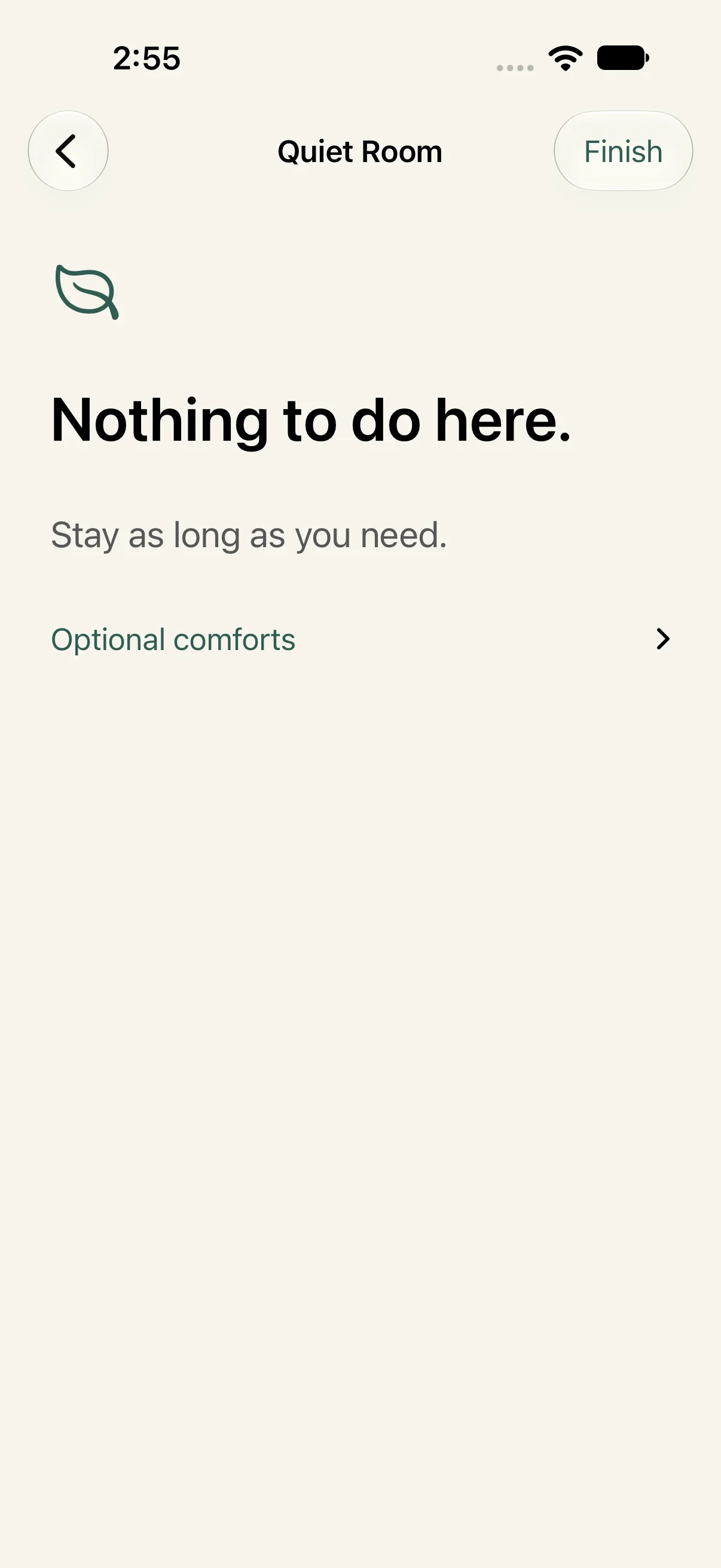
Quiet Room starts silent. Breathing, animation, and audio are separate opt-ins. Back and Finish stay visible while optional comforts remain collapsed.
The unresolved question is whether Finish creates an unnecessary extra exit step. A calm visual does not settle that interaction question.
Quiet Room’s default state, with optional comforts collapsed.
COMMUNICATE / CHOSEN DISCLOSURE
Review the words before sharing them.
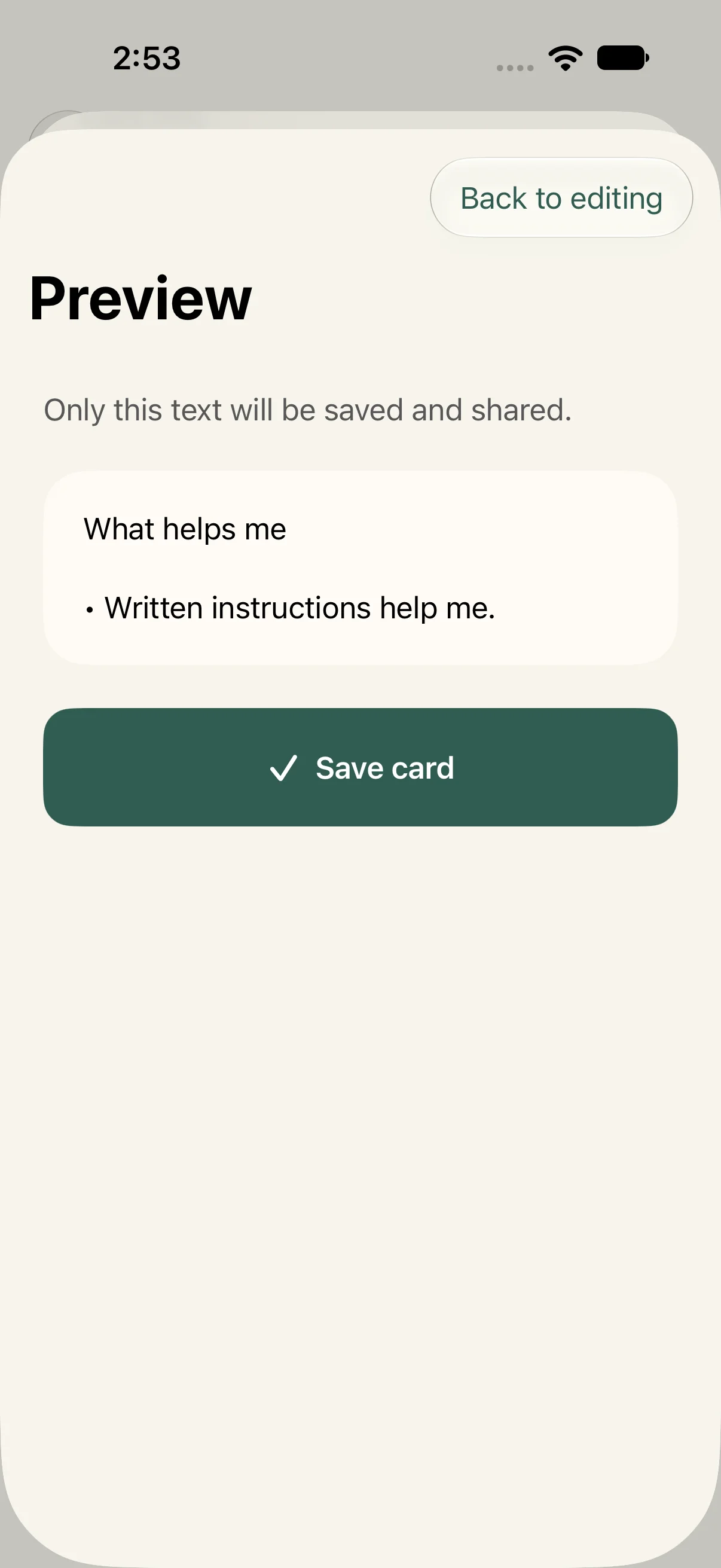
Support cards let people choose statements, add their own wording, and preview what will be shared. The design makes disclosure an explicit action, rather than treating personal needs as profile metadata.
Support-card preview: selected statements remain visible before sharing.
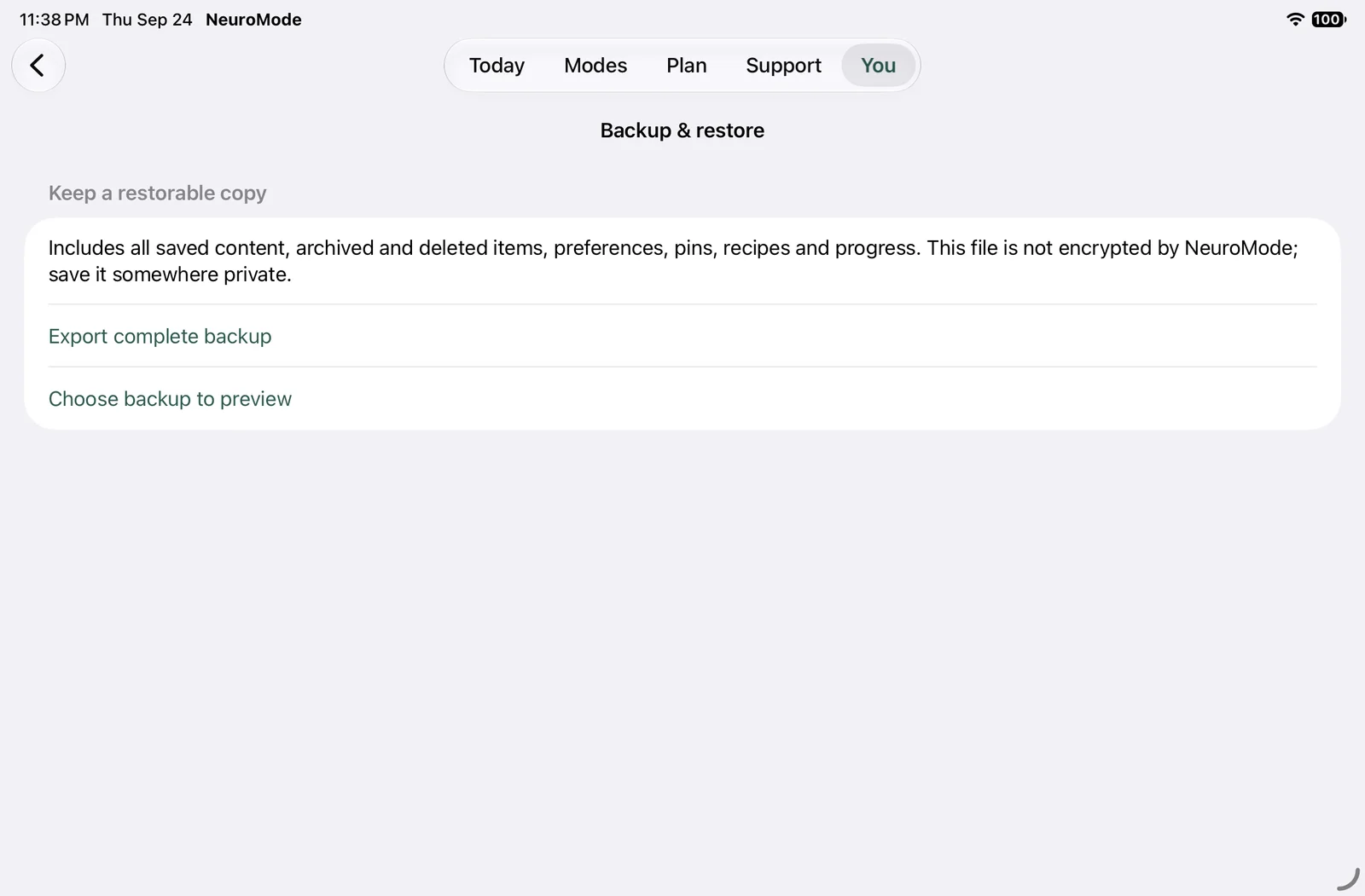
Recovery deserves a larger view.
Local-first storage removes account setup, but places responsibility on recovery. Backup validates a file before previewing replacement. Confirmation makes clear that restoration replaces current records and clears scheduled notifications and Live Activities; it does not merge them.
Retained iPad landscape backup interface: preview consequences before committing.
Native labels, heading traits, and selected states support nonvisual navigation. Human VoiceOver focus-order checks remain pending.
Visible Move controls and menu actions supplement dragging. Voice Control and Switch Control task completion remain unverified.
Semantic text, scrollable layouts, and selected largest-text simulator checks support text scaling. Every screen and sheet still needs coverage.
Audio starts explicitly and stops on interruption or backgrounding in documented checks. Physical-device comfort and audio routing remain to be assessed.
Undo, paused sessions, and Recently Deleted make recovery part of the product model; comprehension still requires participants.
08 / EVALUATION & ITERATION
The interface changed through verification.
Repository differences and recorded integration testing show concrete changes. None of these revisions is attributed to participant feedback.
Recovery was fragmented
Observed issue
The first repository milestone lacked a unified saved-item recovery surface.
Design / implementation change
A searchable library, archive, and Recently Deleted were added. Restored activities return to Later.
Git comparison eab8750 → ba80bcf. User benefit remains inferred.
Import also deleted the item
Observed issue
Both automatic buttons in a shared-inbox row executed during integration testing.
Design / implementation change
Independent borderless button styling separates import and delete, keeping the imported note readable.
Documented defect and fix in the validation report; no separate before screenshot retained.
Dark buttons lost contrast
Observed issue
White text on pale sage and weak secondary text were identified in visual/audit review.
Design / implementation change
Adaptive on-accent foreground and opaque semantic secondary text replaced those combinations.
Recorded revision and retained dark screenshot. No invented before image.
56
Distinct tests reported passing across final runs.
The project’s latest validation record combines final runs; it is not one uninterrupted all-green run. Tests establish technical behavior, not participant usefulness or release readiness.
The audit also found questions worth keeping open.
Several onboarding answers are stored but do not feed recommendation rules. Asking those questions creates an expectation that the answers matter. The next revision should either clarify that promise or connect it to tested behavior.
Other review priorities include preserving scripts and routine drafts after save failures, clarifying search scope, and testing whether recovery remains findable when optional prompts are disabled.
Design and engineering meet at the state boundary.
This independent project has no documented formal team or stakeholder workshops. Cross-functional thinking appears in the handoff: what persists, what remains a draft, when a save sheet closes, and what happens when permissions are refused. SwiftUI, SwiftData, Xcode, SF Symbols, XCTest/XCUITest, and Git are evidenced tools. Figma is the specified next design environment.
09 / OUTCOME & REFLECTION
Saving data isn’t the same as preserving a place.
NeuroMode demonstrates implemented support paths, reversible preferences, local recovery, and a design model that can be inspected beyond the screens.
What is demonstrated
A feasible native foundation: editable steps, preserved context, independent sensory choices, and documented technical iterations. Reverse engineering makes the architecture and its trade-offs explicit.
What comes next
Run the prepared formative study, evaluate Figma refinements, and complete human assistive-technology and physical-device checks. Test mismatched suggestions and interruption recovery before adding features.
The assumption most worth challenging is that fewer visible elements always mean less effort. A simpler layout hides context; a hidden countdown hides time; a quiet room hides options. Each reduction creates a responsibility to preserve discovery and an exit.
The strongest next outcome would be a person finding useful support, understanding what changed, and returning with enough context to continue.
No clinical benefit, adoption, retention, or measured cognitive-load improvement is claimed. Participant research and a completed Figma prototype remain future work.