← All work

04 / iOS PRODUCT CONCEPT · 2026

Gather

Less debating. More together.

An iOS concept that helps friends choose a plan with everyone’s needs in mind and room for an honest vote.

GATHER / NATIVE iOSGather

Less debating.
More together.

Private choices. One shared plan.
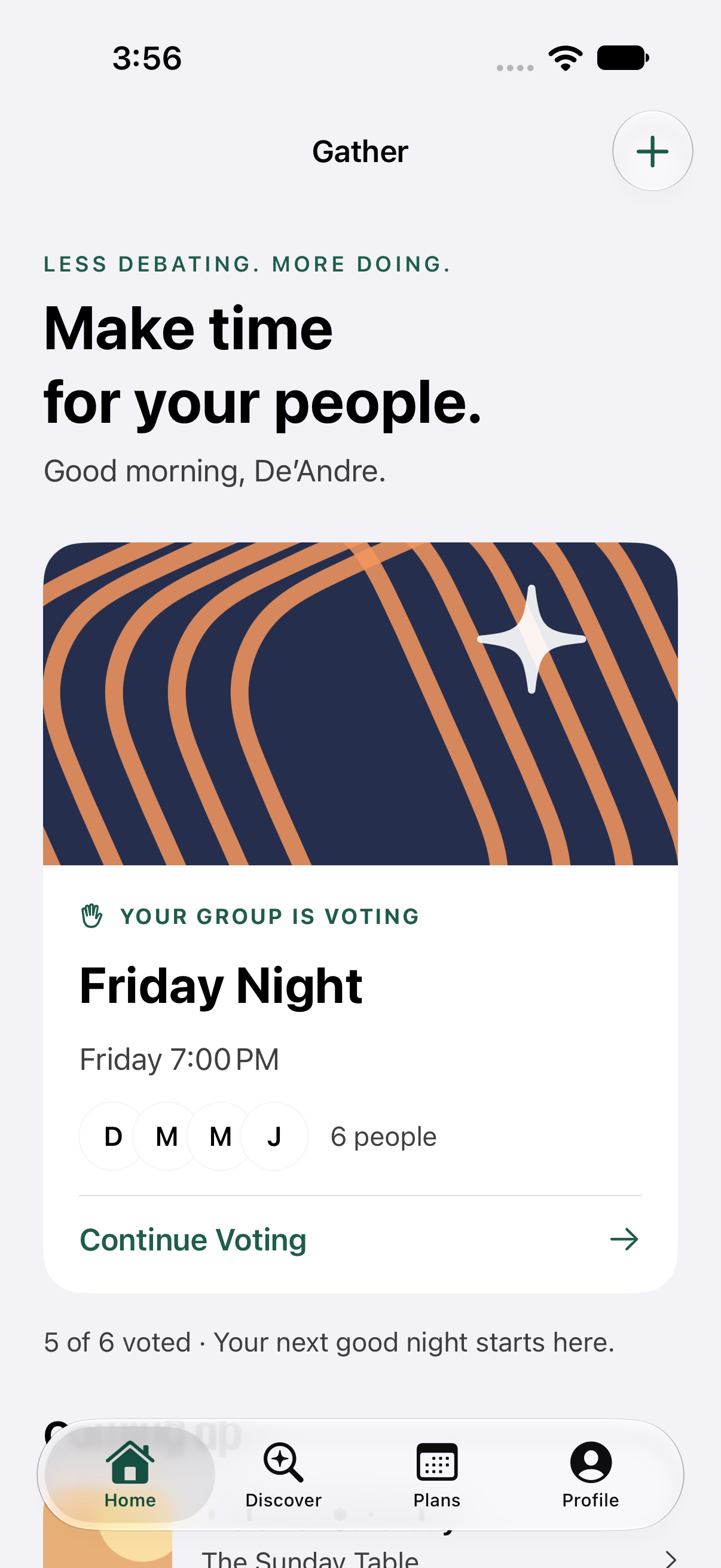
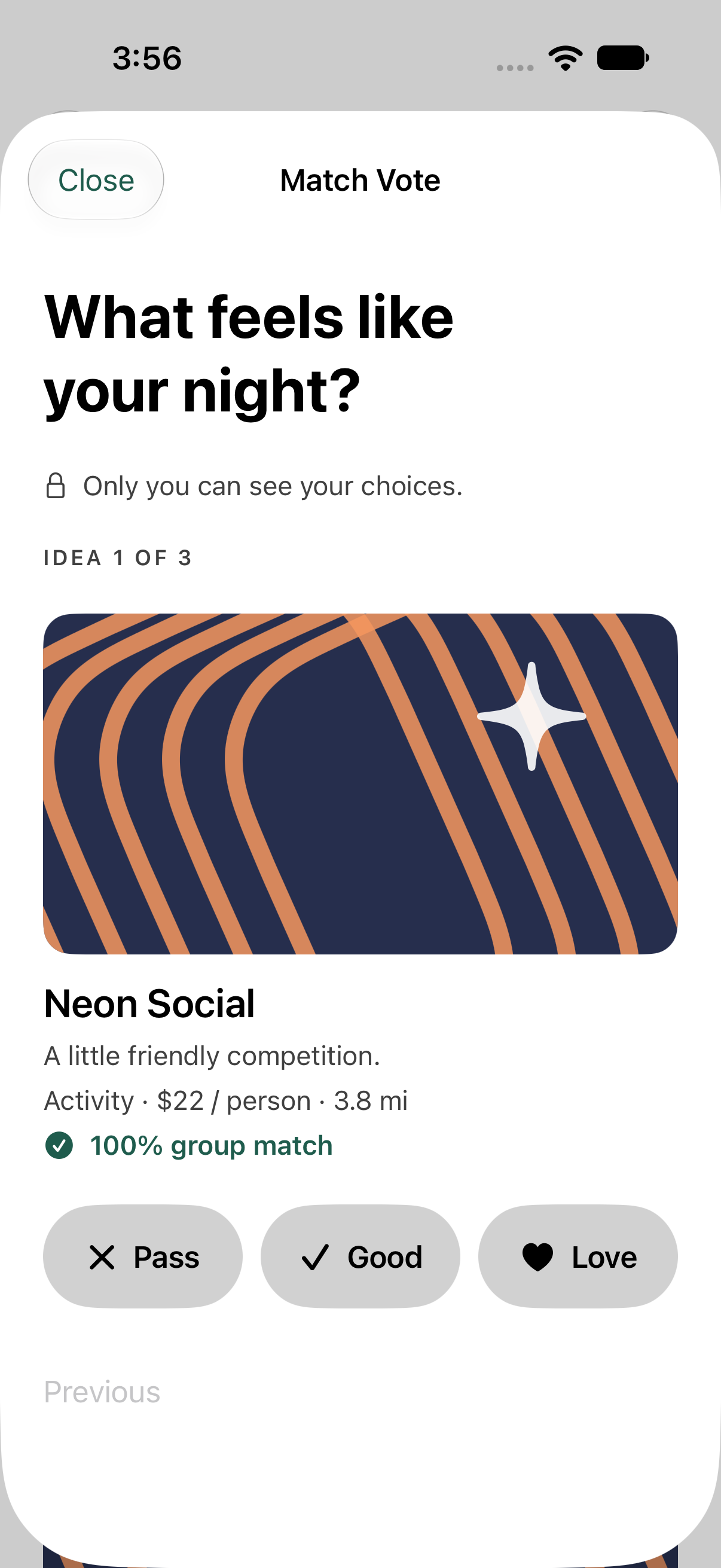
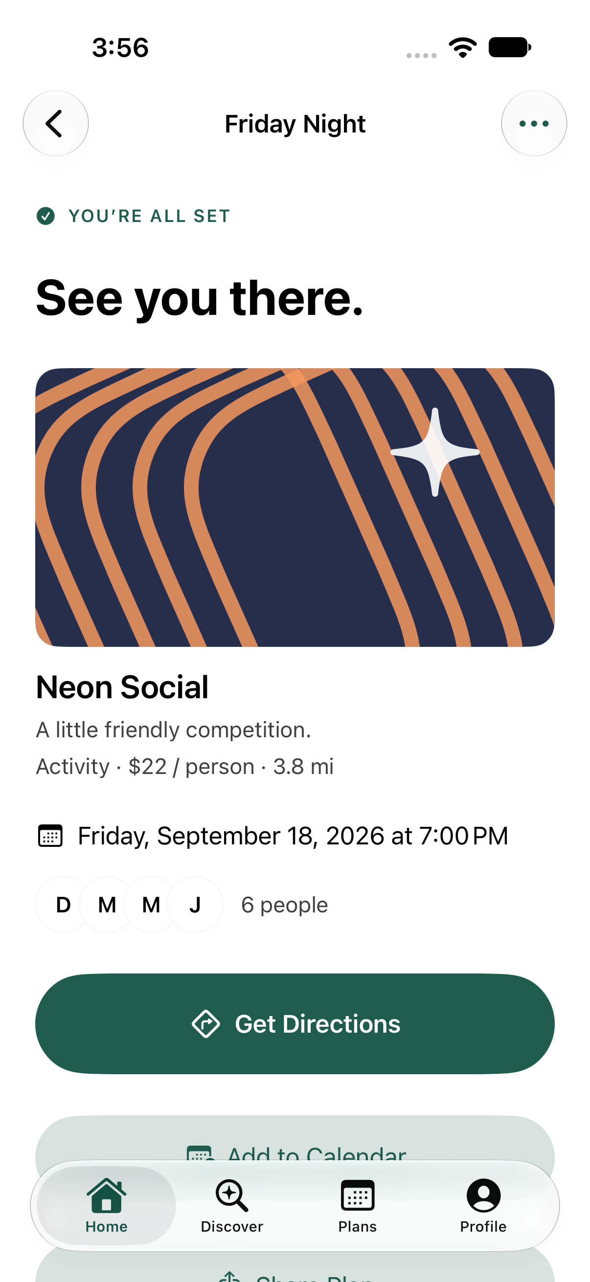
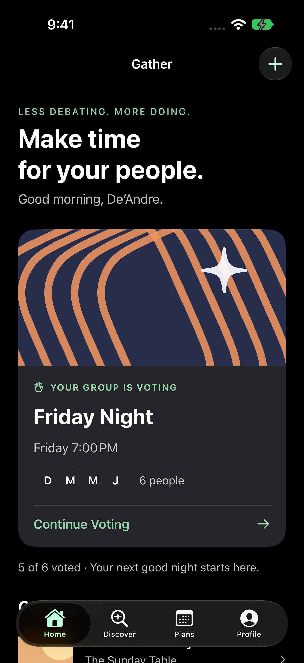
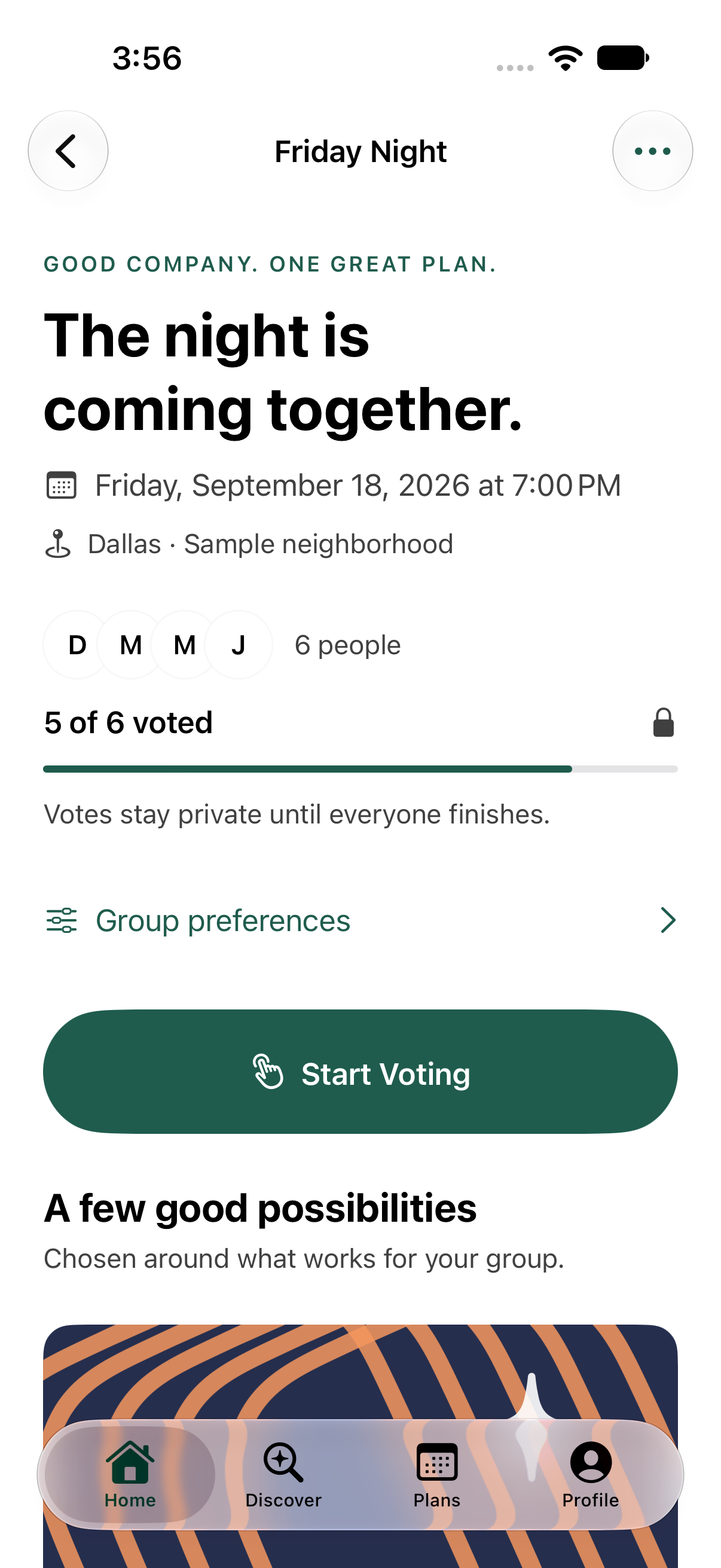
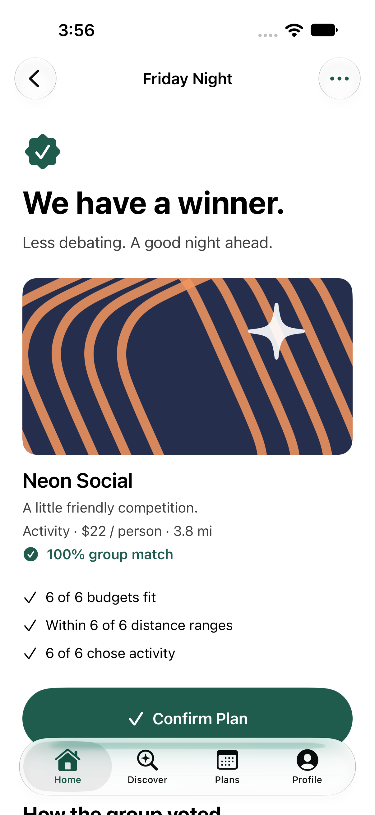
Gather home interface, captured in the iPhone SimulatorGather voting interface, captured in the iPhone SimulatorGather final interface, captured in the iPhone Simulator

01 / THE OPPORTUNITY

Making a plan shouldn’t be the hard part.

A group chat is great for conversation. It’s a difficult place to keep track of a decision. Gather brings interests, practical constraints, and private choices into one focused journey.

The premise
Ideas, timing, and budgets become scattered. Unspoken requirements can be missed, while more suggestions do not necessarily create agreement.
The design response
A shared lobby, recommendations that respect everyone’s needs, private voting, a group result, and a plan people can follow.
My role
Product brief and UX direction, including the group decision-making model, voting, preferences, and activity selection.
Collaboration
Designers and developers contributed to the project. Codex supported development as a tool.

Concept developed from a product brief with design and development contributions. These premises are hypotheses, not interview findings. Venues, people, votes, and accessibility metadata are sample data; this is not an App Store release or Apple-affiliated project.

02 / THE EXPERIENCE

One continuous path to a shared plan.

Home establishes the next step. The lobby brings the group together. Voting makes room for an honest preference; consensus turns the aggregate result into a plan.

GATHER IN MOTION / 40 SECONDS

From a private vote to a shared plan.

Silent walkthrough with on-screen captions. Recorded in the running app using sample participants and venues.

Open video separately
Read the walkthrough transcript
  1. 00:00 — Pick up the plan. Home makes the next step clear.
  2. 00:04 — Find common ground. See group progress without revealing individual choices.
  3. 00:09 — Choose honestly. Choose Love, Good, or Pass. Review choices before submitting.
  4. 00:23 — Reach a decision. Aggregate results explain the group match. Confirm the plan.
  5. 00:30 — Make it happen. The final plan brings details, directions, and a calendar action together.
Pick up the active plan.

Pick up the active plan.

Pick up the active plan.
Find common ground and start voting.

Find common ground and start voting.

Find common ground and start voting.
Choose privately: Pass, Good, or Love.

Choose privately: Pass, Good, or Love.

Choose privately: Pass, Good, or Love.
See the aggregate result after all ballots are complete.

See the aggregate result after all ballots are complete.

See the aggregate result after all ballots are complete.
Leave with a confirmed plan.

Leave with a confirmed plan.

Leave with a confirmed plan.

Original, unretouched Simulator captures. Select a screen to enlarge it. The group-match score reflects shared preferences in the demo. It does not verify a venue’s accessibility or suitability.

03 / DESIGN REASONING

Small choices. Meaningful differences.

01 / DECISION

Give the group one next step.

Home prioritizes the active plan; Start Voting appears before recommendations in the lobby. Browsing remains available without becoming a prerequisite.

Trade-off: Less content up front, more direction.

02 / DECISION

Make room for an honest pass.

Love, Good, and Pass express different levels of interest. Individual choices remain private, with aggregate results withheld until all ballots are complete.

Trade-off: The group waits for everyone before seeing the result.

03 / DECISION

A must-have isn’t a nice-to-have.

Preferences affect ranking; requirements determine eligibility. Missing required accessibility information excludes an option rather than assuming suitability.

Trade-off: A smaller set of ideas may be the appropriate answer.

04 / VISUAL LANGUAGE

Warm in character. Clear in purpose.

Forest-green actions anchor a warm illustrated identity. Familiar iOS controls provide structure, while conversational copy gives the app its voice.

Forest

#1F5C4D

Apricot

#F5975E

Midnight

#262E4D

Cream

#FADEA6

Typography
Semantic iOS text styles establish hierarchy and adapt to Dynamic Type.
Rhythm
24-point page gutters and a 12, 16, 24, 32 spacing rhythm group content with whitespace instead of extra borders.
Appearance
System surfaces and labels adapt to appearance. The separate dark accent is pale green (#94D1AD); warm illustration colors remain expressive.
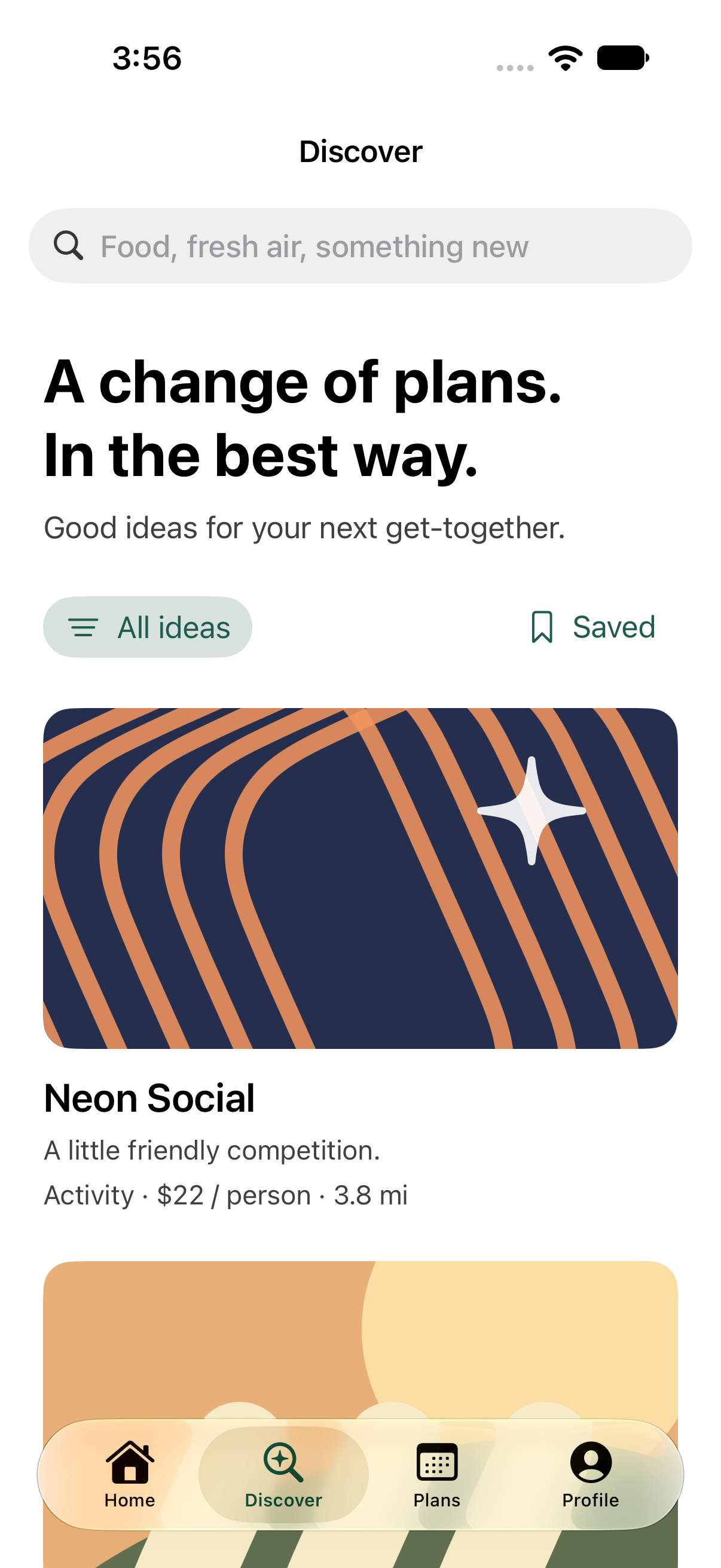
Discovery makes room for inspiration.

Discovery makes room for inspiration.

Discovery makes room for inspiration.
Home in dark appearance with Increase Contrast enabled.

Home in dark appearance with Increase Contrast enabled.

Home in dark appearance with Increase Contrast enabled.

05 / DUO DESIGN EXPLORATION

More room. Same plan.

An interactive layout study explores compact, expanded, and fold-aware arrangements while keeping the selected plan consistent.

Compact
A focused plan view with a clear route back to the plan list.
Expanded
The list and selected plan sit together when space allows and stack on narrow previews. More context appears without adding tasks or exposing private votes.
Fold-aware
A divided layout explores how content could adapt across a larger screen.

This is a web proposal, not a native Duo implementation or device capture. Dimensions, transitions, and assistive-technology behavior still need native validation.

Try the interactive Duo exploration

06 / INCLUSION

Consideration is part of the interface.

Requirements inform the eligible options without appearing in participant summaries or shared invitations. Voting uses words and symbols together, exposes selected values to assistive technology, and excludes decorative artwork from the reading order.

Semantic text can grow. Voting responses stack at accessibility sizes, primary labels receive the full available width, and reduced-motion settings disable voting transitions. Native tabs, navigation stacks, and a dismissible voting sheet retain familiar interaction patterns.
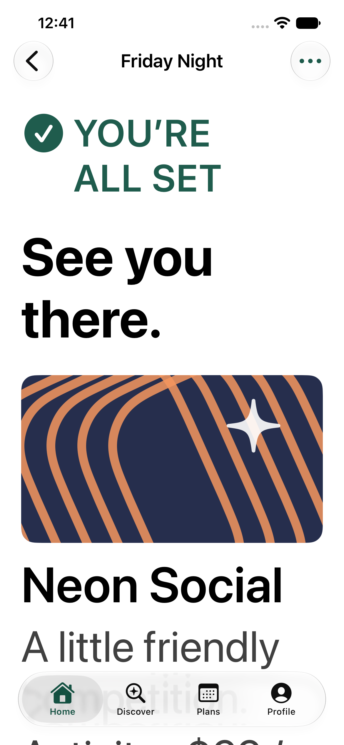
Final plan at the largest accessibility text size on the smaller iPhone 17e Simulator.

Final plan at the largest accessibility text size on the smaller iPhone 17e Simulator.

Final plan at the largest accessibility text size on the smaller iPhone 17e Simulator.

VoiceOver, Switch Control, Reduce Transparency, landscape, permissions, and physical-device behavior still require manual validation.

07 / REFINEMENT & QA

The polish is in the follow-through.

Testing the app exposed contrast, action hierarchy, and navigation issues that were less apparent in static screens.

Secondary text was too quiet.
Strengthened secondary-text contrast following the native accessibility audit.
The action came after browsing.
Moved Start Voting above the recommendation list.
Large labels needed more room.
Removed competing icons from primary buttons at accessibility text sizes.
Confirmation inherited scroll position.
Returned the plan to its heading when its state changed.

App checks covered voting, navigation, smaller screens, and larger text. Participant testing is still needed to learn whether private voting helps groups reach a decision.

08 / OUTCOME & REFLECTION

A working idea. A clear next chapter.

The functional native concept connects private choices, group consensus, and final-plan actions. Its core journey runs offline using sample participants and venues.

Creation, discovery, preferences, saved activities, and final-plan actions extend beyond the central walkthrough. Live collaboration, real venue providers, reservations, widgets, and Live Activities remain future work.

Questions for the next study

  • Do people understand the difference between a preference and a requirement?
  • Does private voting help people express a real preference?
  • Can organizers recover confidently from a tie or an all-pass round?
Next case study

UXD Systems

UXD Systems: aligned comparison of Apple HIG, Material 3, and Carbon
Actual product interface · Visual Design / Design Systems