1 / AT A GLANCE
Help the organizer take the next step.
- The opportunity
- Bring a relevant action, its explanation, and the tools to complete it into one workspace. The hypothesis: knowing what to do next can help a willing organizer prepare to share.
- Who it is for
- Adults preparing their first small community fundraiser with limited time. This is the proposed research audience, not a validated user segment.
- My contribution
- I directed the product, with AI assistance in design, research synthesis, development, and verification.
- Where the work stands
- A working prototype and a defined research plan. Participant sessions and measured fundraising outcomes are still ahead.
2 / STRATEGY & SCOPE
Improve the first invitation before adding more tools.
St. Jude already offers fundraising pages, toolkits, social assets, and support. The opportunity is to test contextual guidance within that journey—not assume the existing services are missing.
Focus first
Setup, a personal story, event details, a saved preview, and one invitation asset. Together, these produce something an organizer can review and use.
Defer until useful
Supporter management, channel analytics, team permissions, and long-term retention require different research and integrations. More features would not settle the core question.
How might a first-time organizer know what to do next, understand why it matters, and leave with something ready to share?
3 / RESEARCH & ASSUMPTIONS
Test the reason people pause.
The riskiest assumption is that organizers stall because they cannot prioritize. They may instead lack time, struggle to recruit help, or feel uncomfortable asking for money. Guidance cannot resolve every barrier.
- Secondary research
- Public fundraising and donation materials established what services already exist. They did not reveal difficulties inside authenticated tools or internal abandonment data.
- Product review
- Technical and interface checks identified navigation, empty-state, and small-screen problems. Development feedback also shaped giving-frequency choices and editable identity.
- Still to learn
- Whether prioritization is a real obstacle, whether the recommendation fits the organizer’s situation, and whether existing guidance already meets the need.
If organizers already know their next action, I would investigate what prevents them from completing it. A smaller content or onboarding improvement may be more useful than another workspace.
4 / THE FIRST INVITATION
One journey, from an idea to an invitation.
- 01
Choose
Set a format, date, team, and goal.
- 02
Prepare
Write the story and explain where to join.
- 03
Review
Inspect and save the campaign preview.
- 04
Invite
Reuse the details in a promotional asset.
- 05
Return
Review the next suggested action.
The six-step setup collects useful context, but may delay the first useful result. I would compare it with a shorter path that asks for extra context only when it changes a recommendation. This journey is a design hypothesis awaiting participant evaluation.
5 / GUIDANCE & CONTROL
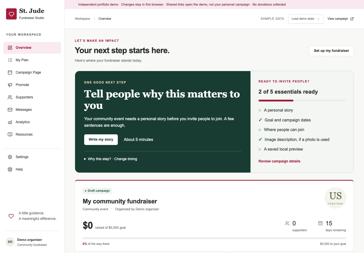
One action. A reason. Room to disagree.
Prioritize the task
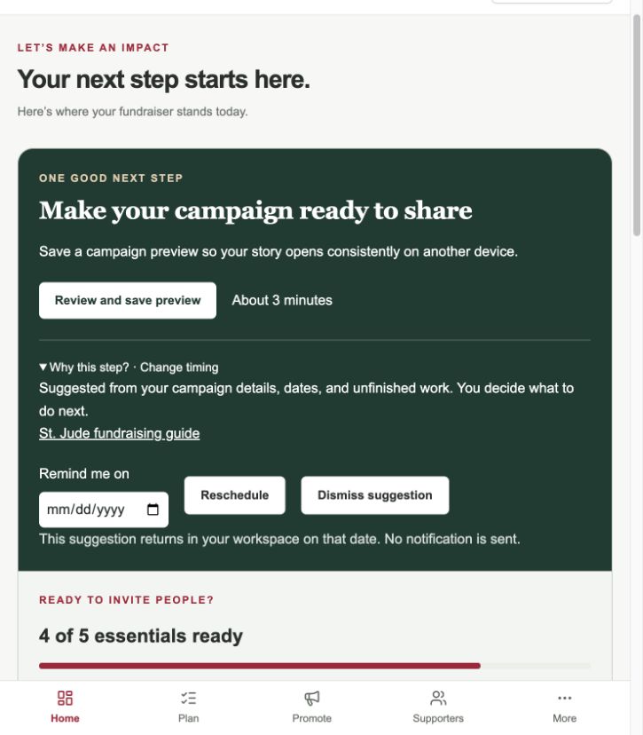
A specific action comes before the metrics. The readiness checklist gives context without competing with the next step.
Show the reason
Rules use missing content, dates, saved-preview state, and unfinished work. “Why this step?” makes the recommendation understandable. It is rule-based guidance.
Keep the choice
An organizer can dismiss, reschedule, or restore a suggestion. Rescheduling returns it in the workspace; it does not send a notification.
The tradeoff: one recommendation reduces competing actions, but it may choose the wrong priority. Testing should ask people to explain and challenge it. Displayed task durations are estimates, not measured completion times.
6 / CONTENT & TRUST
Carry the story forward. Make the limits clear.
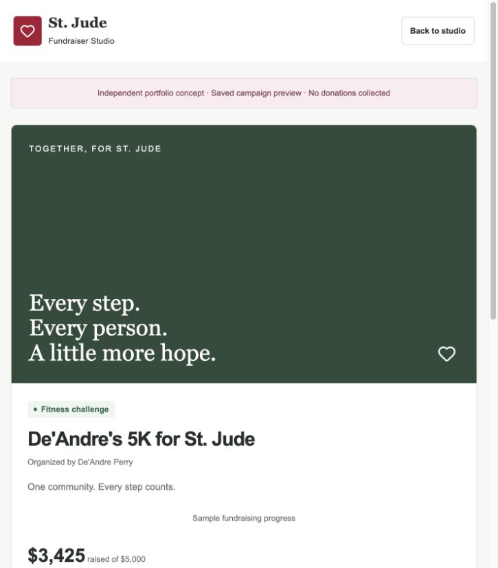
Campaign details connect the editor, saved preview, and promotional templates. Organizers can reuse their message instead of entering it again at each step.
A draft is not a saved preview
Editing and saving are distinct. Changes need to be saved again before they appear in the preview. Templates constrain styling while keeping the personal message and event details editable.
The public demo’s boundary
Drafts and previews stay in the current browser. Shared links and QR codes open the demo, not the organizer’s personal campaign. There is no cross-device sync or donation collection.
Giving should be an informed handoff.
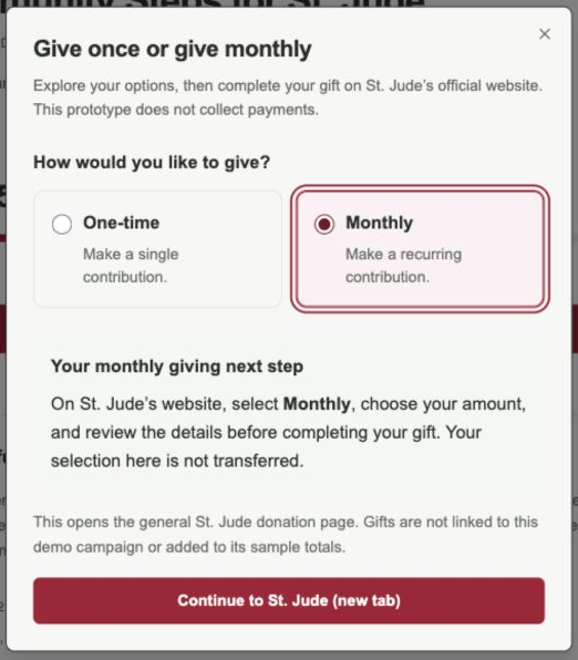
The dialog explains one-time and monthly giving, then links to St. Jude’s general donation page. The selected frequency does not transfer, and gifts are not attributed to the demo campaign.
That extra choice may be redundant. I would compare a clear explanatory link with the dialog and ask participants where payment happens and whether their choice carries over.
A click is not a completed donation. The immediate goal is understanding the handoff.
7 / ITERATION & INCLUSION
Verify the journey, not just the destination.
Navigation appeared unresponsive
Changed the affected links and saved campaign state before navigation.
Onboarding and ten workspace destinations were checked on the published build.
A new campaign implied existing activity
Started fresh campaigns with zero supporters and money, plus blank story and location.
Empty states and the next-story suggestion were checked October 5.
Feedback covered mobile navigation
Moved the notification above navigation and corrected resource-count wrapping.
Resource search, singular counts, and small-screen layouts were checked.
Warmth without pressure.
The optional heart is a personal reaction, not a popularity count or donation. Its pressed state, keyboard support, 44px target, and reduced-motion behavior keep the interaction optional and understandable.
Labeled fields, visible focus, error focus, dialog focus return, flexible layouts, and alternatives to dragging support the core tasks.
Technical evaluation and remaining checks
October 3 checks recorded no automated axe violations on 17 desktop routes and no horizontal overflow at tested widths from 320–1440px. These results apply to that version. They do not establish usability or complete accessibility.
The PDF records the later display-name edit as build-tested, with browser verification still needed. Manual screen-reader use, zoom, Safari and Firefox, and sessions with disabled participants remain research priorities.
8 / RESEARCH PLAN
Decide what evidence would change the design.
The proposed study starts with five adult organizers: three first-time and two experienced. No participant sessions have been conducted.
Understand the context
Discuss a recent or planned fundraiser before introducing the concept. Look for barriers to sending the first invitation.
Observe the core task
Use a neutral scenario and sample data in 30–40 minute sessions. Ask people to prepare and review a campaign, then create an invitation.
Probe trust and control
Ask what a link exposes, why an action is recommended, what rescheduling does, and what happens after choosing monthly giving.
Revise and retest
Record task context, observed behavior, assistance, severity, and the proposed change. Retest critical changes with fresh participants.
Decision rules
- Investigate any lost work, wrong destination, or failed save.
- If two participants misunderstand a recommendation, revise its wording or hierarchy.
- Review any material payment or privacy misunderstanding immediately.
- Resolve blocking accessibility issues before releasing the affected flow.
Protect the research
Use voluntary participation, separate recording consent, anonymous IDs, and a stated deletion date. Do not collect donor lists, patient stories, credentials, or payment details.
Use a neutral script and record assistance consistently. Seek a second review of the synthesis to challenge designer bias.
Measure readiness before fundraising impact.
The proposed measure is the share of eligible new organizers with a campaign meeting agreed readiness criteria and a saved preview within seven days. Include non-completers and allow the full observation window.
Readiness is only a proxy. A production measure needs a baseline, version-consistent previews, approved access, and safeguards for unintended sharing and accessibility barriers. It does not measure invitations sent or donations received.
9 / OUTCOME & REFLECTION
A working direction. A clear next decision.
- Delivered
- Explainable next-step guidance, editable campaign content, saved previews, connected promotional templates, and an explicit official-site donation handoff.
- Not yet established
- Whether the guidance matches real priorities, reduces assistance, or improves campaign completion. No fundraising impact has been measured.
- What comes next
- Validate the narrow invitation workflow, revise from observed behavior, then review organizational fit before proposing integrations or broader features.
The most useful lesson was to separate a working feature from a useful intervention. Fixing navigation and save behavior made the prototype testable. Research still has to establish whether the suggested next step is the one an organizer actually needs.
Project references
The October 5 case-study PDF documents the public desk review, original captures, development checks, and proposed research. The linked public demo is a newer browser-saved edition.
Read the complete case studyNeuroMode
A way back.
Support that makes room
for the person.